So by this Christmas, God-willing, an all-new zoecarnate.com will be in beta phase! The world-famous 8,000+ links directory of all things alternative and Christian will have a new, clean design, user-friendly interface, and (soon thereafter) a smartphone app that will enable you to find churches, bloggers, intentional communities, nonprofits, etc., wherever in the world you are – all thanks to Jonathan Stegall. We’re excited.
(Wanna contribute to the redesign effort? Go here. Are you a foundation, philanthropist, or entrepreneur interested in a potentially larger donation? I have an intriguing offer on the table for a matching grant-investment from a private donor that expires at the end of this year; email me at zoecarnate [at] gmail [dot] com for details.)
So one of the most exciting pieces of the redesign, for me, is the prospect of replacing that super-outdated (and kinda egotistically tacky) pic of my buddy Philip Scriber and I with a bona-fide logo! To that end, my friends at Sharp Seven Design have been hard at work creating mockup possibilities.
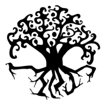
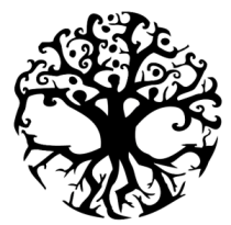
Could you take a moment and tell me which of these three you like best, in the comments section below? Ryan and Holly at Sharp Seven would have me stress that these are not finalized logos, but only their initial drawing-board mockups. (You can see some of their finished work right here.) I’m not necesarrilly going to land on one of these three, as I have some tweaks to suggestion and potential mergers of elements from a couple of these. But what do you think? If you will, give me two-part feedback: First, call out the letter of which you like best, A, B, or C, and then whatever commentary you’d like to offer. So you know, what I’m looking for in this logo is an iconic Tree of Life image that is also Triune in design, like an energetic dancing Godhead. But I don’t know if I want the Trinitarian aspect to be as overt as these samples here. So…tell me what you think! Thanks.


I like A becasue it has that one root on the left side that is reaching further than the other roots. B and C have that left-hand root too, but they have other roots which are also close to it. How it’s drawn on A makes me think of a reaching out to things that are further away from center.
My first thought about the 3 people in the tree was not the Trinity, but community – the tree itself is God/the tree of life, and people find their home in it.
I vote for zoecarnate c. It’s hard to describe, but I think that having the limbs/branches kicking up and bowing down make for a more interesting picture. The other images have a little too much white space in their centres.
It is a little easier to see the figures in zoecarnate a and b, but I actually like not seeing everything in an image right away. I think it gives it more depth and makes it more interesting to look at.
🙂
I like c. a is too dense at the top. B has too much of a celtic feel for me.
I would enjoy the top pattern of c being a little more like a vine and a little a more paisley feel mixed in somehow.
I vote B. One simple reason: the people are more clearly defined.
I like B.
I’m gonna go with C – inclusive
I really like A, myself.
C. It’s more balanced.
C.
C. I like the tree of life but didn’t notice the people in A at all till I saw the other two. The people add a super dimension!!
I vote for C, more balanced and lots of LIFE, second would be A.
B: Not as complex… it’s ‘simpler’
( LOL it doesn’t look yet like there’ll be a clear
majority favorite…. might have to draw straws 🙂
I vote B. It’s cleaner and will work better a smaller sizes. They all remind me of the Zerg, but I bet that’s me playing too much Star Craft.
– Peace
I like B in the sense that the “community/trinity” seems not as hierarchical(C seems to have one higher that the others). One thing I would suggest is to somehow include animals into the Tree. We are interconnected in Life not just within our species, but with ALL creatures.
I like B. Not as busy. Though I do like that C is more explicitly circular.
I vote c.
Love C more integrated holistic feel with the circle. A and B have a somewhat fragmented / broken feel to it as the roots are not connecting with the branches as in C. C allows the eye to resolve the circular motion. Also has a nice “stamp” quality to it. Like the circular design in the branches for A better than in C. Nice balanced contrast with the jagged roots – can that aspect be incorporated into C – as the jaggy branches vs circular branches are the only thing about C I would change.
I hope that there are more to choose from. I do not care for any of them. These are really too busy. It needs to be more simplistic. I believe that less is best.
C… It was my initial choice and I like the uniformity of it.
without reading everyone else’s first, I lean toward C because of the connection of the roots and the limbs
plus, I love trees and I also love the combination of growth, interconnection/reaching out, growing deep roots, etc
the thought of the Trinity included is pretty nice because it doesn’t immediately jump out at you
I like C.
A. Rich & full.
I like C
A is the most subtle. The “trinity” is a bit too overt in B and C for my taste.
A looks more like an interesting tree that happens (upon closer examination) to have some intricacies.
My choice would be A.
A quick comment however …. the roots almost look like nails …. is that intentional? The contrast with the top I understand, but wish the roots looked a little more organic and less industrial …. they almost remind me of the sculpture at Dachau …. and for some reason the roots seem harsh ….
b
I like A.
B. I like that you can see the three peoples arms better. They look like they are raised in praise and worship. For that reason, B seems more joyous, happy, ecstatic, etc. I don’t see that in A or C. Also, B is not as cluttered. Simple is usually better.
I like B – it has more white space and is easier on the eyes.
I vote for you telling us how to get in touch with you in the Raleigh Durham area. I’ve looked (OK> maybe I’m blind) but can’t find any sort of local connection…? I’m curious where you are fellowshipping these days.
I vote A. For me, B, while cooly celtic, seems too niched in style. C is nice in that it’s more round, but that also distracts from the figures.
my vote is for c.
They really are all good. I think you should make your own choice because you will have to live with it for awhile.
I like all of them but, if you really want my opinion, I like B. I believe in the saying, less is best. It seems to be less busy. Really it is up to you and I know that you already have your favorite in mind.